Archive for the ‘Uncategorized’ Category

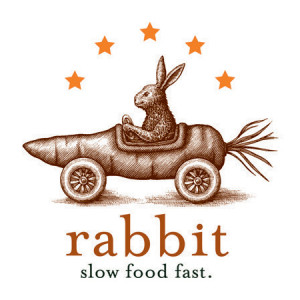
Rabbit Restaurant Logo Illustrated by Steven Noble

Saturday, December 14th, 2013

Steven Noble along with award winning visual communications design studio Tasty Concepts, worked together to create a logo based on a playful name that was hand-illustrated in an engraving style for the Rabbit restaurtant logo identity back in 2011. The logo depicts a rabbit driving a race car in the shape of a carrot. A series of additional logos were added to the collection that includes a locomotive, airplane, and canonball.

Tasty Concepts has received a recognition award from LogoLounge for the Rabbit logo.

Rabbit_Logo_Pos

8727a59dfa3a223081cc5d112f6bc7b8

Sterling Vineyards Label Illustrated by Steven Noble

Saturday, December 14th, 2013

In 2012, Diageo presented Steven Noble and Hatch Design with the opportunity to rebrand their incredibly successful winery, Sterling Vineyards. We both took a look back and discovered a beautiful SV monogram that, while an integral part of their past, had never been used externally or on any packaging. Steven Noble redrew the SV monogram to update the mark, and when combined with a clean modern design and their signature silver color, it was like breathing new life into the packaging for a time-honored brand. The illustration was created in a scratchboard woodcut style with particular attention being made to the building and vineyards.

ff9002fbba924ec4dbc26b6abf2f3da4

33c3029ce0a3b51723d36f3a57d6e655

October Playing Cards

Saturday, December 14th, 2013

The frightfully fun and whimsically illustrated artwork of Steven Noble will send shivers down your spine.

Packaged inside the box you will find one tricked out deck of playing cards. Everything from the back design, ace of spades, jokers, and court cards were customized.

Be warned for they might just take on a life of their own.

Our latest deck of playing cards brings life to our favorite time of year, with 52 spirits for you to fear.

63fcc68cdf5676b9ffc59d267356d68f

52a43f68d36312b033beb0e1505be0cc

738a55673330a9eb3c4da4ba78d991f7

Saturday, December 14th, 2013

In 2012, Diageo presented Steven Noble and Hatch Design with the opportunity to rebrand their incredibly successful winery, Sterling Vineyards. We both took a look back and discovered a beautiful SV monogram that, while an integral part of their past, had never been used externally or on any packaging. Steven Noble redrew the SV monogram to update the mark, and when combined with a clean modern design and their signature silver color, it was like breathing new life into the packaging for a time-honored brand. The illustration was created in a scratchboard woodcut style with particular attention being made to the building and vineyards.

33c3029ce0a3b51723d36f3a57d6e655ff9002fbba924ec4dbc26b6abf2f3da4

Tavern on the Green Logo Identity by Steven Noble

Saturday, December 14th, 2013

For their reboot of Tavern on the Green, owners Jim Caiola and David Salama wanted Steven Noble to create a logo that felt contemporary while still referencing the restaurant’s storied past. The logo will be used throughout the restaurant on menus and business cards, as well as on the restaurant’s famous red awnings through how they tweaked each iteration of the logo — beginning with the first prelimnary draft — before landing on this final look.

Tavern on the Green was originally built as a sheepfold in current day Central Park . The sheep were actually held there at night and let out on Sheep Meadow during the day to graze and mow the lawn. Since we were going for this farm to table concept, the sheep really were a good vision for that sort of food.

The idea was to contemporize the Tavern on the Green brand. But they always knew they were ode-ing to the sheep. There was a history they were trying to acknowledge with the crest and the animals. When you see this, you think of a family’s history or a place’s history, so they liked this idea.

The final design feels timeless, but also contemporary. It feels fun, but not too self-conscious. It’s beautiful and modern and clean.
18fdeda589a7ce6d731f13a70907a3b3dddd4ee453325a68b06bfc5e2bfbffec

Woodcut Illustration

Monday, August 19th, 2013

The Woodcut style is defined by simulating the old fashioned woodblock carvings of the 18th century and often re-creating a retro modern version to fit today’s needs for advertising, packaging design, publishing and logo identity purposes. The technique requires the use of the scratchboard medium which works most effectively to accomplish this end result. Furthermore, the style is mostly associated with “bold”, less detailed, line strokes along with loose uncleaned cuts along the outer edge of the illustration. This is a clear distinction from the other scratchboard styles such engraving, and steel engraving styles.

See woodcut samples: http://www.stevennoble.com/v/Woodcuts/

The original woodcuts (Xylography) from the 18th century were carved out from wood blocks with printing parts remaining level with the surface while non-printing parts are removed. The areas to show ‘white’ are cut away with a knife or chisel, leaving the characters or image to show in ‘black’ at the original surface level. The block is cut along the grain of the wood (unlike wood engraving where the block is cut in the end-grain). The surface was then covered with ink by rolling over the surface with an ink-covered roller, leaving the ink upon the flat surface and not on the non-printing areas.

In the present world, the woodcut style is merely simulated since there are often edits to be made by the demanding clients of today’s world. The level of detail is also specific to the size/scale of the illustration. For example, the Coors “waterfall” logo was accomplished by developing three different versions for three different sizes. One illustration version was created for use on the 12 ounce beer bottle label (.5’ – 1”) which was the simplified version, a second for use on the twelve and twenty-four pack cartons (2” – 6”) which was the middle version, and the third made for the delivery truck (6’ – 8’) which was the detailed version.

See logo samples: http://www.stevennoble.com/v/Logos/

The first step is to lay down the “approved” completed preliminary sketch onto a clean blackened piece of scratchboard by laying out the broad, general outline onto the scratchboard first. From there, pencil marks can be transferred to leave behind mark/outlines of the general forms from the sketch/drawing. Once this is completed, then the carving blade is used to scrap away the excess amount of black scratchboard around the outer area surrounding the illustration. The general lines are then scraped away to create the forms beginning from top to bottom. Afterwards, the shadows and details begin to take their shape through a process of improvisational line strokes across each of the forms.

The finished/completed reflective black and white art is then scanned from a flat bed scanner into the Adobe Photohop program and then cleaned-up using the magic wand command at a tolerance of 85 -100 and saved as a high resolution bitmap tiff file. To add color, the artwork is then saved in RGB and a layer is created (multiply selected) to allow color to be added behind the black and white line work. This gives more flexibility to allow for any quick edits and other adjustments such as color saturation and brightness and contrast.